Vizcom Media
A large format printing company, bursting at the seams, needed a new home for their operation and expanding staff that included the merging of a trade show display company and space for a showroom.
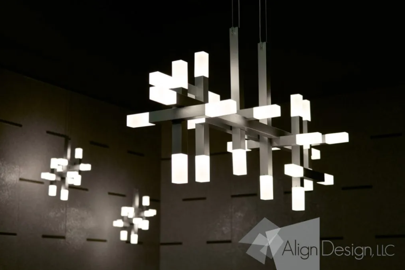
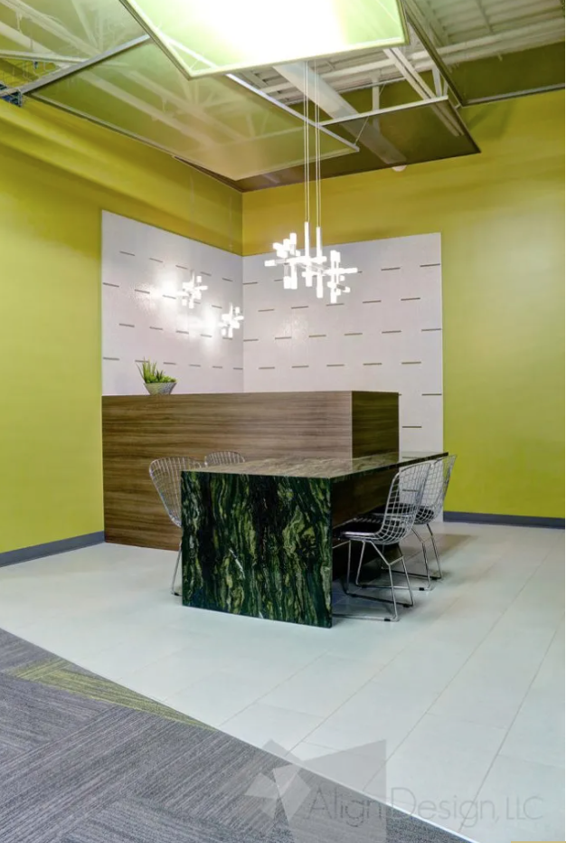
VizCom’s gray and green logo, with an emphasis on the diagonal of the letter V in the company’s name, set the tone for the crisp and modern design concept that the owners were looking for. Geometric lighting choices, and linear patterns in the flooring carry the concept all the way through.
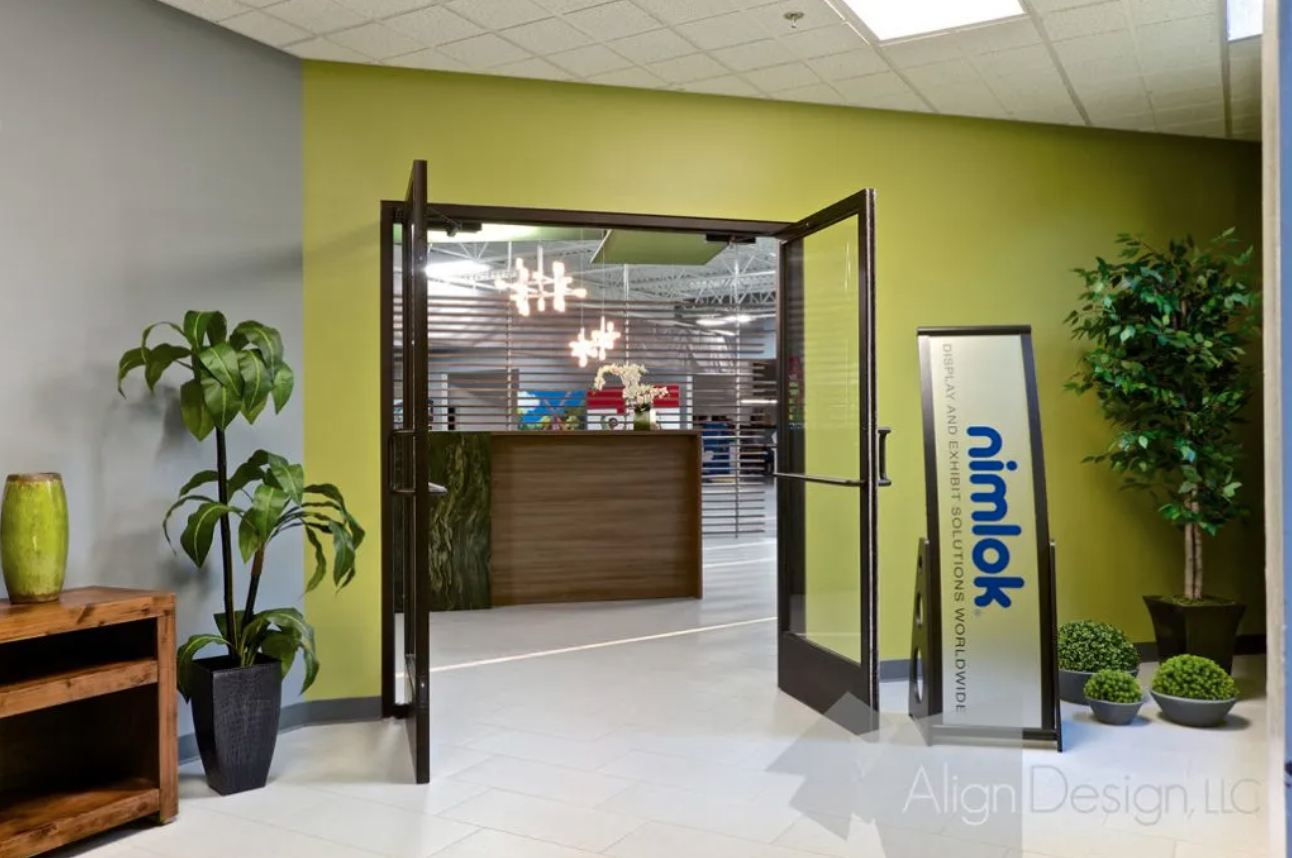
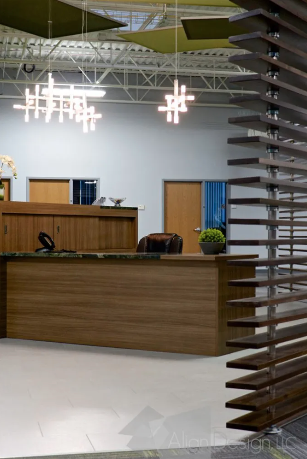
A new, air lock entry was created at the far end of the 50,000 square foot space. Setting the walls on a diagonal, directed the placement of the reception area.
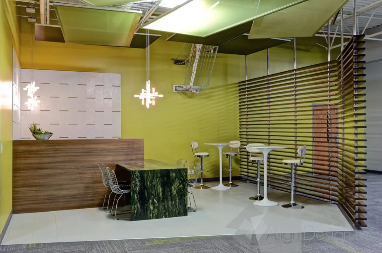
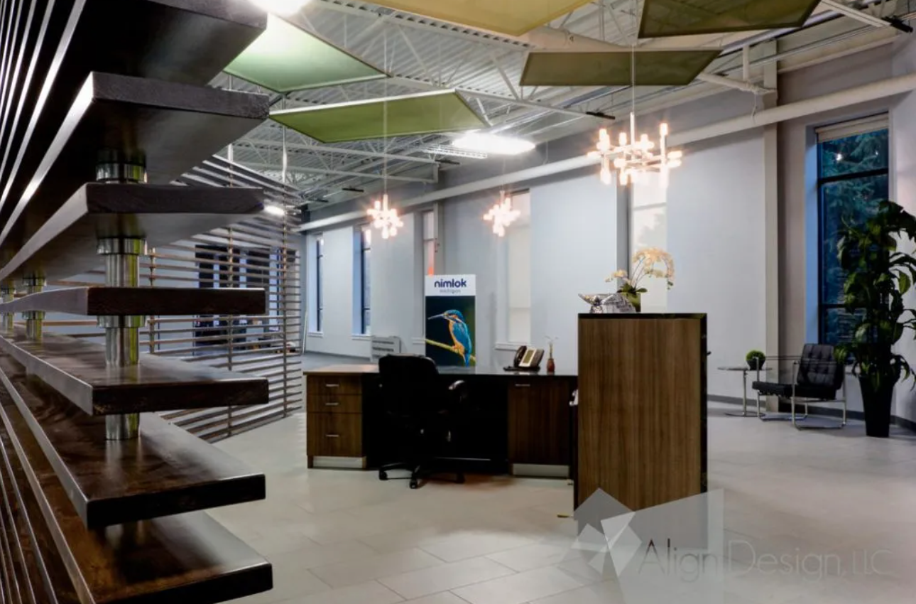
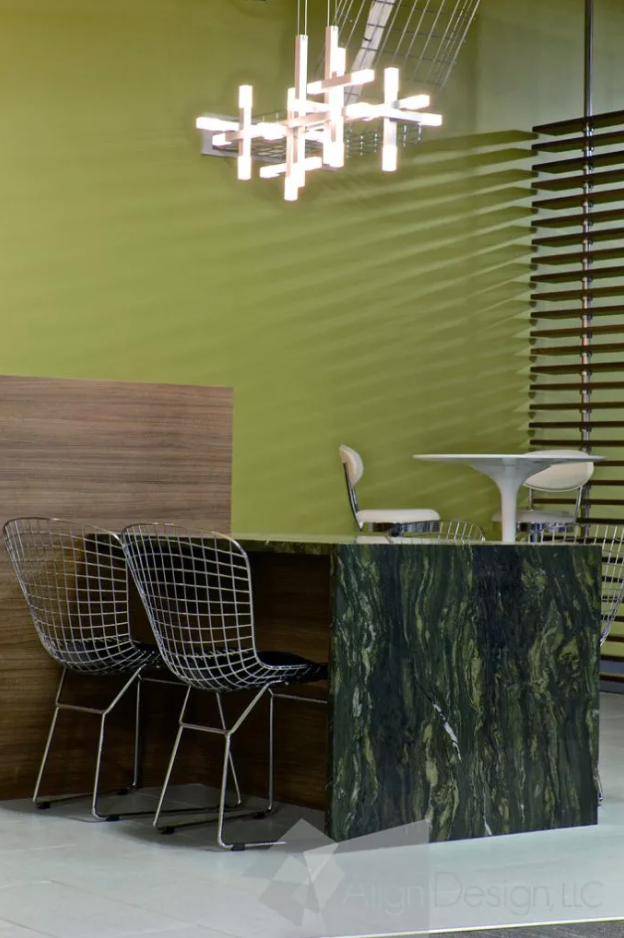
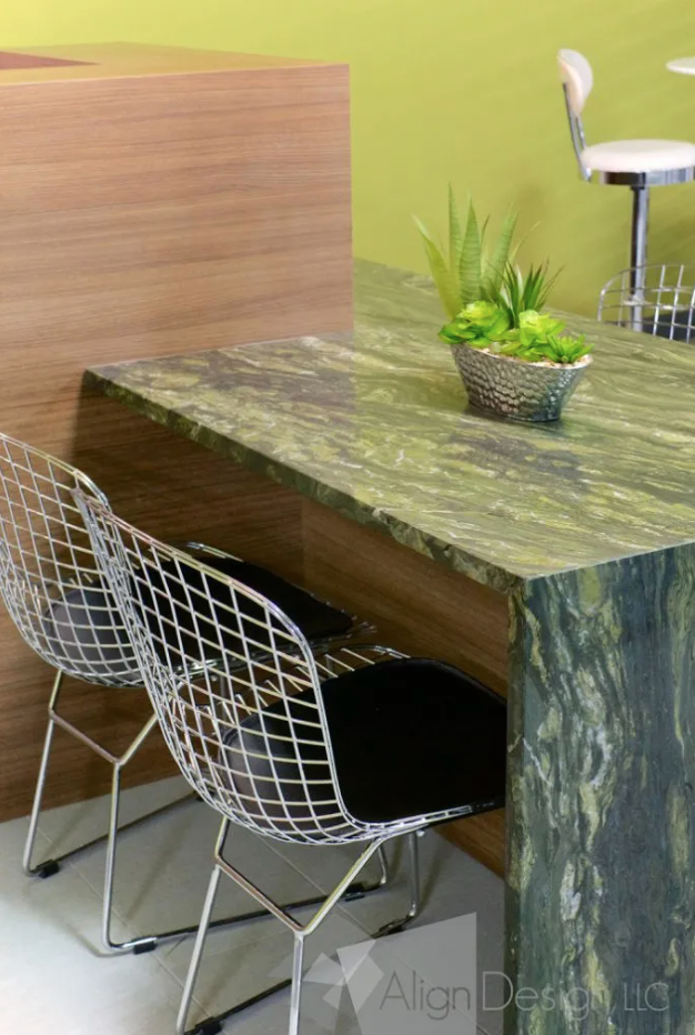
A custom, bi-level reception desk with a waterfall, granite front greets visitors as they enter the space. A custom slatwall, mimicking a V, provides a delineation of reception area and showroom without hiding what lies beyond.
A casual lounge area at the opposite end of the showroom, also with a custom built bi level coffee bar, provides a place to sit down with customers and talk over their choices. The porcelain flooring and slat wall were also placed diagonally to flow with the overall concept.
