West Asheville Overhaul – Colors
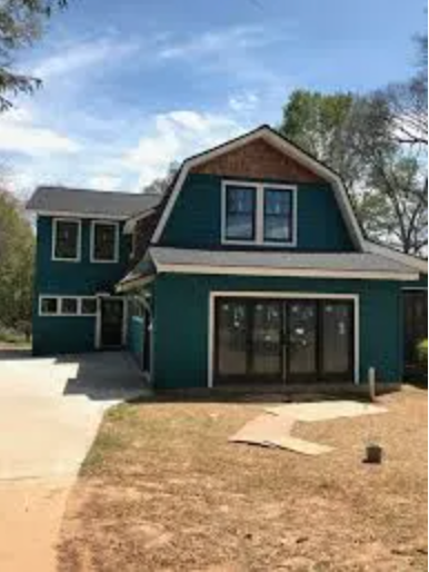
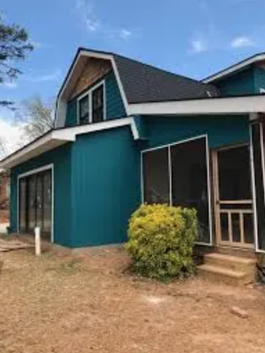
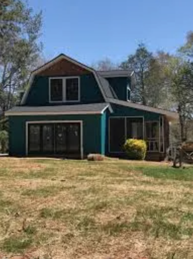
If you’ve been following the progress of the West Asheville Overhaul, you probably know that we were trying to land exterior paint colors for this house for quite some time. After more than several trials, we ended up with Sherwin Williams – Really Teal – 6489.


Although the original design lent itself to a white exterior to accentuate those amazing black windows and doors, and the cedar shakes, to give it a modern farmhouse vibe, what the client had in mind was totally different. What they wanted instead was a vibrant blue and I was tasked with finding “A turquoise or similar Southwestern or Mediterranean color”.
One thing that I know, and take to heart as a designer is that one has to stay fluid and open to the clients’ desires. In this particular case, against my better judgement, since the color that they had in mind was is so non traditional. Being in West Asheville, I figured that we would be able to make an uncommon color fly there more than if we were in another neighborhood in the city.


That being said, color can be very fickle and it’s tricky to find the balance between intentional and costly mistake.
Color can be affected by the time of day and the weather conditions causing the hue and tint to change depending on the mood of the day. Color also evokes strong emotions in people and is very personal. What looks lovely to one person can have a disturbing effect on another.
I once talked to a massage therapist about the color choice of her massage room. She had repainted it several shades of green – psychologically a very calming color – because she had one client who said that her first shade choice reminded her of the Catholic school that she had attended as a girl, where she had had the opposite of a nurturing experience.
The fact is, design, as color, is subjective and personalized. Any good designer knows that and focuses on the best outcome for the client, not on whether or not the project will produce a great photo shoot, or how many people will approve. As a matter of fact, we got a lot of commentary on the choice. From the contractor’s crew to random passers by, people were eager to share their opinions. It was pretty evenly split between, “Oh my gosh. They aren’t going to keep it that color are they”?, to “I love it. It’s so unusual”.
In the long run, How I feel about the color has nothing to do with the final choice. As a designer, I’ve worked with countless clients, whose projects never made my portfolio for several reasons. The main reason being that the end result did not lend itself to a photogenic outcome due to choices made by the client. That being said, not all design is picture perfect. It’s about designing for the client, not for the perfect magazine spread. My main focus is always about what the client wants and needs, not what I think will look the best on my resume’ and in my portfolio. My highest and best outcome is always to have satisfied and happy clients.
View the Final Results of this project here
Related Articles
It’s Starting To Look Like A Home
West Asheville Overhaul - Starting to Feel Like HomeSince the last West Asheville Overhaul post, ‘lots has gone on. None of it very exciting as far as images are concerned, but substantial progress nonetheless.Building or remodeling a home or business is like a well,...
Interior Renderings
West Asheville Overhaul - Interior RenderingsWell, it's been several weeks since our last update on this project that we're calling West Asheville Overhaul. In the meantime, we got a good amount of snowfall here in the mountains. Although it was short lived, it...
It’s Going To Get Worse Before It Gets Better
West Asheville Overhaul - Design ConceptMy last update on our project - The West Asheville Overhaul - showed some of the demolition that had begun. That was only the beginning! Since my last post, the entire structure has been gutted, leaving nothing but a few of the...
